Living Room Color Ideas (Warm, Neutral, Modern, Calming & More)

A well-designed living room doesn’t start with furniture— it starts with color. The moment you walk into a space, your brain is already responding to the color palette: whether it feels calm or chaotic, warm or distant, cohesive or disconnected. That’s why choosing the right living room color scheme is one of the most powerful design decisions you can make.
The goal isn’t just to pick pretty or stylish colors— it’s to create a feeling. The best living room color schemes can completely shift the emotional tone of your home, even if nothing else changes. And if you’ve ever felt like your space looks “almost right” but still off, color is usually the missing piece.
In this guide, I’ll provide practical and stylish living room color ideas that feel warm, welcoming, and elevated. You’ll learn how to build living room color palettes that work with lighting, furniture, and layout, plus how to avoid common color mistakes that make rooms feel cold or flat. I’ll also explore timeless combinations, modern approaches, and soft neutral foundations that never feel boring.
By the end, you’ll have a clear and simple framework for choosing the best living room color scheme that will actually work in your space.
Why Living Room Color Palettes Matter

Color isn’t just visual— it’s emotional. The living room color palette you choose sets the foundation for how your home feels on a daily basis. Even before décor, layout, or styling comes into play, the color palette is influencing mood, scale perception, and comfort level.
A warm beige can make a large, echoing room feel grounded. A muted sage can soften harsh architectural lines. Meanwhile, an overly cool or high-contrast color palette can make even a beautifully furnished space feel uninviting.
What most people miss is that living room color schemes don’t just affect aesthetics—they affect behavior. Warmer palettes encourage lingering and conversation, while cooler combinations can subtly discourage relaxation.
Here’s how color psychology plays into your space:
- Warm tones (terracotta, sand, clay): These create intimacy and comfort. They visually “pull” a room inward, making large spaces feel cozier.
- Cool tones (blue-gray, mist green): These expand visual space and can feel calming, but require balance to avoid feeling distant.
- Neutral bases (cream, taupe, soft gray): These give flexibility and longevity, allowing décor to evolve without repainting.
Ultimately, a good living room color palette unifies the space and quietly supports everything else in the room.
Types of Living Room Color Schemes
Not all color schemes create the same mood. Before choosing a color palette, it helps to understand some of the different approaches you can take. Here are the main types of living room color schemes I’ll be discussing:
- Warm color schemes: Cozy and inviting, built around beige, terracotta, and warm neutrals
- Neutral color schemes: Soft, flexible palettes that prioritize simplicity and longevity
- Modern color schemes: Clean and structured with controlled contrast and muted tones
- Calming color schemes: Light, airy color combinations with subtle cool undertones
- Earthy color schemes: Nature-inspired color palettes with organic, grounded tones
- Bold color schemes: High-contrast, expressive palettes designed to make a statement
Each approach creates a different feeling in your space. Below, I’ll walk through each one in more detail and provide suggestions.
5-Color vs 3-Color Living Room Palettes
Although 5-color swatches are commonplace in visual design, you don’t need five or six colors to design a beautiful space. In fact, the most cohesive living room color schemes are built on three core tones:
- A base color (walls and large surfaces)
- A secondary tone (upholstery, rugs, or curtains)
- An accent color (pillows, art, and décor)
From there, additional variation comes from:
- Lighter and darker versions of each color
- Natural materials like wood, stone, and metal
- Texture (linen, wool, boucle, leather)
This approach keeps your living room color palette cohesive, flexible, and easy to execute— without feeling overly designed. That’s why the following suggestions focus on three core colors rather than overly complex palettes.
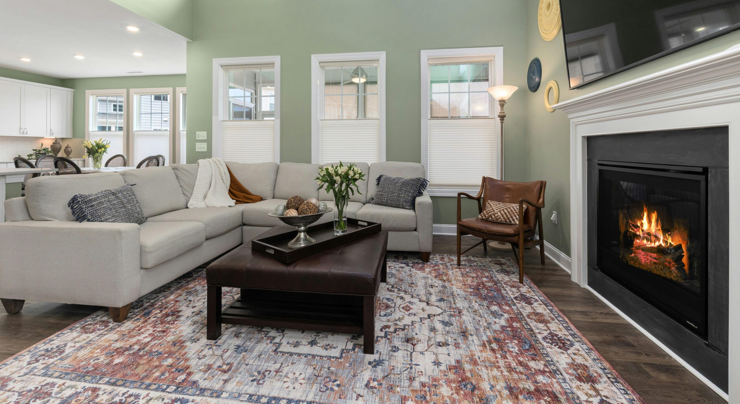
Warm Living Room Color Schemes
If there’s one category that consistently works in real homes, it’s warm palettes. These warm living room color schemes are designed to soften edges, add comfort, and create that effortless “come sit down” feeling.
Warm color schemes are especially powerful in rooms with lots of natural light or open layouts that feel too expansive. They visually anchor the space and make it feel lived-in rather than staged.
Here are some highly effective warm living room color ideas:
1. Cream + Muted Clay + Warm Taupe

- Cream: #F3EDE3
- Muted Clay: #B86B4B
- Warm Taupe: #A8927C
This color palette feels grounded and organic. It works beautifully with natural wood furniture and woven textures. It’s one of the best living room color palettes for creating warmth without being heavy or overly rustic.
2. Ivory + Honey Beige + Olive Green

- Ivory: #FAF6EF
- Honey Beige: #E6C28B
- Olive Green: #6E7C5C
This palette introduces subtle contrast while staying warm and grounded. It’s one of the more versatile living room color schemes for layered interiors.
3. Sand + Muted Gold + Burnt Sienna

- Sand: #E7D3B1
- Muted Gold: #B89B5E
- Burnt Sienna: #A24A3F
This is a richer, more dramatic take on warm living room color palettes, perfect for spaces that need more richness, depth, and personality.
4. Soft Cream + Deep Teal + Warm Caramel

- Soft Cream: #F5EFE6
- Deep Teal: #2F5D62
- Warm Caramel: #B8793B
Unlike my previous living room color ideas, this palette introduces a richer level of contrast while still feeling warm and grounded. Most warm palettes rely on closely related earth tones— but this one uses teal as a counterpoint, which provides more dimension and visual interest.
5. Dusty Rose + Soft Beige + Light Walnut

- Dusty Rose: #CFA3A0
- Soft Beige: #EEE4D7
- Light Walnut: #8B6B4F
A softer feminine take that still feels elevated and warm. It works especially well in living rooms with soft textiles and curved furniture.
Warm living room color palettes like these rarely go out of style because they feel human. They don’t rely on trends— they rely on comfort.
Modern Living Room Color Ideas
Modern interiors don’t have to feel cold or minimal. The best living room color schemes balance clarity with warmth.
Modern color palettes typically rely on muted saturation and controlled contrast. Instead of bold primary colors, you’ll often see softened tones that feel layered and intentional.
Here are some modern living room color ideas that are balanced and refined:
1. Soft Stone + Charcoal + Off-White

- Soft Stone: #BFB7AE
- Charcoal: #3E3E3E
- Off-White: #EBE7E2
This palette creates structure without harshness. It’s one of the most popular living room color schemes for contemporary spaces.
2. Soft Gray + Warm White + Muted Brick Red

- Warm White: #F5F1EB
- Soft Gray: #CFC6BD
- Muted Brick Red: #A65A4D
This modern living room color palette brings warmth and structure, which is exactly what modern interiors need to avoid feeling cold. The muted red reads sophisticated, rather than bold or vintage.
3. Cream + Espresso + Muted Olive

- Cream: #F5EFE6
- Espresso: #4B3621
- Muted Olive: #7A8265
This is a grounded, sophisticated take on modern living room color schemes, especially effective with natural textures like linen and leather.
4. Navy + Sand + Warm Stone Gray

- Navy: #2F3E4E
- Sand: #E5D3B3
- Stone Gray: #989084
A balanced living room color palette that adds depth without feeling heavy. It works especially well in structured, symmetrical layouts.
Modern color palettes succeed because they reduce visual noise. They let architecture and furniture breathe while still creating atmosphere.
Neutral Living Room Color Palettes
Neutrals are often misunderstood as “safe,” but the best living room color palettes can be layered, dimensional, and deeply personal.
The key is variation in tone and texture— not flat repetition.
Here are a few popular and stylish neutral living room color schemes:
1. Natural Linen + Soft Gray + Ivory

- Natural Linen: #DFD9CF
- Soft Gray: #BAB0A4
- Ivory: #F6F2EA
2. Warm White + Mushroom + Light Oak

- Warm White: #F7F4EE
- Mushroom: #B7ADA3
- Light Oak: #C9B49A
3. Stone Gray +Taupe + Sand

- Stone Gray: #B8B5B0
- Taupe: #A79A8D
- Sand: #E2D2BC
These neutral living room color palettes work because they rely on subtle shifts rather than contrast. The result is calm but never flat.
Neutrals also give you long-term flexibility. You can change accent colors seasonally without disrupting the foundation, making them one of the most practical approaches overall.
Airy & Calming Living Room Color Schemes
Not every living room needs to feel cozy. Sometimes, what a space really needs is breathing room. These calming living room color schemes lean into softness and subtle cool undertones to create a calm, restorative environment.
Calming palettes are especially effective in homes that feel busy, overstimulating, or visually cluttered. They don’t demand attention— they quiet the space down.
1. Misty Blue + Pale Gray + Soft White

- Misty Blue: #A9BFCB
- Pale Gray: #D6DADB
- Soft White: #F5F7F6
This calming living room color palette feels clean and weightless without becoming sterile. It works beautifully in rooms with good natural light, where the blue can shift softly throughout the day.
2. Sage Green + Light Driftwood + Warm White

- Sage Green: #A8B5A2
- Light Driftwood: #C9B8A6
- Warm White: #F4F1EC
This is one of the most livable living room color schemes if you want calm without feeling cold. The sage provides a natural softness, while the driftwood tones keep it grounded.
3. Lavender Gray + Dusty Blue + Ivory

- Lavender Gray: #B7B2C2
- Dusty Blue: #7C92A6
- Ivory: #F6F2EA
A slightly more layered calming color palette that feels elevated and a bit unexpected. The lavender undertone softens the blue and prevents the space from feeling overly coastal or predictable.
Calming palettes work best when paired with minimal contrast and soft textures. Think sheer curtains, matte finishes, and layered neutrals that support the palette rather than compete with it.
Organic & Earthy Living Room Color Ideas
Earthy palettes sit at the intersection of warm and natural— they’re less about coziness and more about connection. These earthy living room color schemes are inspired by nature, using tones taken from soil, stone, wood, and foliage.
They’re especially effective if your goal is a space that feels relaxed, layered, and slightly imperfect in the best way.
1. Olive + Sandstone + Clay

- Olive: #6F7355
- Sandstone: #D1BB97
- Clay: #B46A4D
This is a classic earthy color combination. The olive adds depth, while sandstone keeps the palette light enough for everyday living.
2. Warm Stone + Forest Green + Muted Sandstone

- Warm Stone: #9F9589
- Forest Green: #3F5F4A
- Muted Sandstone: #CFBB99
This palette leans into a deeper, woodland-inspired direction rather than sun-baked earth tones. It feels grounded and organic, but noticeably cooler and more serene than your other earthy living room color palettes.
3. Weather Wood + Umber Brown + Soft Ochre

- Weathered Wood: #BFA58A
- Umber Brown: #6B4A3A
- Soft Ochre: #C9A24A
This palette feels warm, grounded, and slightly more refined. The ochre adds warmth without overpowering, while cream keeps everything balanced.
Earthy color palettes shine when paired with natural materials— wood, stone, linen, and ceramics. They’re less about perfection and more about creating a space that feels lived-in and connected to its surroundings.
Bold Living Room Color Schemes
If your goal is to create impact, bold palettes are where personality comes through. Bold living room color schemes rely on contrast, saturation, and deeper tones to create a space that feels intentional and expressive.
Bold doesn’t mean chaotic— it means confident.
1. Navy + Rust + Brass

- Navy: #2F3E5C
- Rust: #B55239
- Brass: #B08D57
A bold but highly livable living room color combination. The rust warms up the navy, making it feel inviting rather than formal.
2. Crimson Red + Taupe + Matte Black

- Crimson Red: #9E2B2F
- Taupe: #B1A59A
- Matte Black: #2F2F2F
This living room color scheme is bold in a clean, architectural way— not earthy, not traditional. The crimson brings depth and energy, while taupe softens it just enough to keep the space livable.
3. Deep Plum + Taupe + Soft Blush

- Deep Plum: #5A3E4B
- Taupe: #A89C94
- Soft Blush: #E6C7C2
This living room color palette leans slightly feminine but still feels grounded and sophisticated. The blush softens the plum, preventing the room from feeling too heavy.
Bold palettes work best when anchored by at least one neutral. Without that balance, the room can quickly feel overwhelming rather than intentional.
The Right Palette for Your Lighting and Layout
Even the most beautiful living room color schemes can fall flat if they don’t align with your space’s lighting and structure. This is where intention matters more than inspiration.
Start by identifying your natural light direction:
- North-facing rooms: Tend to feel cooler and require warmer color palettes to balance the tone.
- South-facing rooms: Naturally warm, so they can handle cooler or more muted palettes.
- East-facing rooms: Bright in the morning, softer later— flexible palettes work best.
- West-facing rooms: Warm in the afternoon, so overly warm colors can feel intense.
Lighting temperature also matters. Warm bulbs enhance earth tones, while cool LEDs can wash them out.
Next, consider layout and scale.
- Large open rooms: Benefit from grounding your color scheme with mid-tone anchors like taupe or olive.
- Smaller rooms: Often do better with lighter, cohesive palettes that avoid harsh contrast.
Once you’ve considered your lighting and layout, use the following approach to choose your final living room color scheme:
- Choose a base color (walls, large furniture)
- Add a secondary tone (rugs, curtains, accent furniture)
- Introduce a third accent color (pillows, art, décor)
This layered structure ensures your living room color palette feels intentional rather than scattered.
When color aligns with light and layout, the room stops feeling like separate pieces and starts reading as one cohesive environment.
Don’t Forget Textiles and Texture
Color doesn’t live on walls alone. The best living room color schemes are brought together with textiles, layering, and material contrast.
Start with rugs. A rug should anchor your color palette and quietly reinforce your dominant tones. Then build outward:
- Cushions and throws: Introduce secondary colors and soften transitions between furniture and walls.
- Curtains: Extend wall tones or add subtle contrast depending on height and light.
- Art and décor: Use these to reinforce accent colors without overwhelming the space.
Texture is just as important as color. Linen, boucle, wool, and natural wood all influence how your living room color scheme is perceived. A flat color can feel rich when paired with the right material.
Think of your palette as a system rather than a single decision. When color and texture work together, the room feels layered, intentional, and complete.
Common Living Room Color Mistakes To Avoid
Even thoughtfully chosen color schemes can miss the mark if a few key principles are overlooked. Most mistakes aren’t about the colors themselves— they’re about how they interact with space, light, and proportion.
Mistake 1: Choosing colors in isolation
A paint swatch never tells the full story. Always test your color choices alongside flooring, furniture, and lighting before committing.
Mistake 2: Ignoring undertones
A beige isn’t just beige— it may lean pink, yellow, or gray. Mismatched undertones are one of the main reasons living room color palettes feel “off.”
Mistake 3: Overusing cool tones
Too many gray or blue-based shades can make a room feel detached. If your color palette leans cool, balance it with warm textures like wood or linen.
Mistake 4: Too many competing accents
When every element is bold, nothing stands out. The best living room color schemes allow one or two focal tones and support everything else quietly.
Mistake 5: Forgetting natural light shifts
Colors change dramatically throughout the day. Always observe color palettes in morning, afternoon, and evening light before finalizing.
Fixing these issues usually doesn’t require starting over— just refining balance. Small adjustments in tone or texture can completely shift the result.
Pulling It Together : How to Choose The Best Living Room Color Scheme

Choosing the best living room color scheme isn’t about following trends— it’s about understanding how color shapes the way your space feels and functions.
Whether you’re drawn to warm, inviting palettes, calming and airy tones, or bold, statement-making combinations, the best approach is always intentional. Start with how you want the room to feel, then build your palette around that goal using a clear structure: a base, a secondary tone, and a thoughtful accent.
What makes a space feel finished isn’t just the colors themselves— it’s how they work together with your lighting, furniture, and materials. When those elements are aligned, even a simple palette can feel layered, elevated, and complete.
If you’re unsure where to begin, start with one palette that feels natural to you and test it in your space. From there, small refinements— adjusting undertones, layering texture, or shifting contrast— can make all the difference.
The most successful living room color ideas don’t just look good in photos— they feel right in real life. And when you get the color scheme right, everything else in the room falls into place more easily.


